
Visualising expeditions to the Chagos Islands
Using interactive infographics to engage audiences
The project
The project involved creating an engaging interactive infographic to communicate the journey through time from the historical explorations to the current scientific expeditions of the Chagos Archipelago. I produced the concept, graphic design and data treatment. This project was completed for web design agency, Octophin Digital for their client the Chagos Conservation Trust. Octophin did the development work to make the design files infographic and the filter functions functional. I then oversaw the visual implementation of the design work to provide feedback on any visual challenges that arose.
The infographic was designed to be embedded in the home page or the Chagos Information Portal and can be found on their website: https://chagosinformationportal.org/.

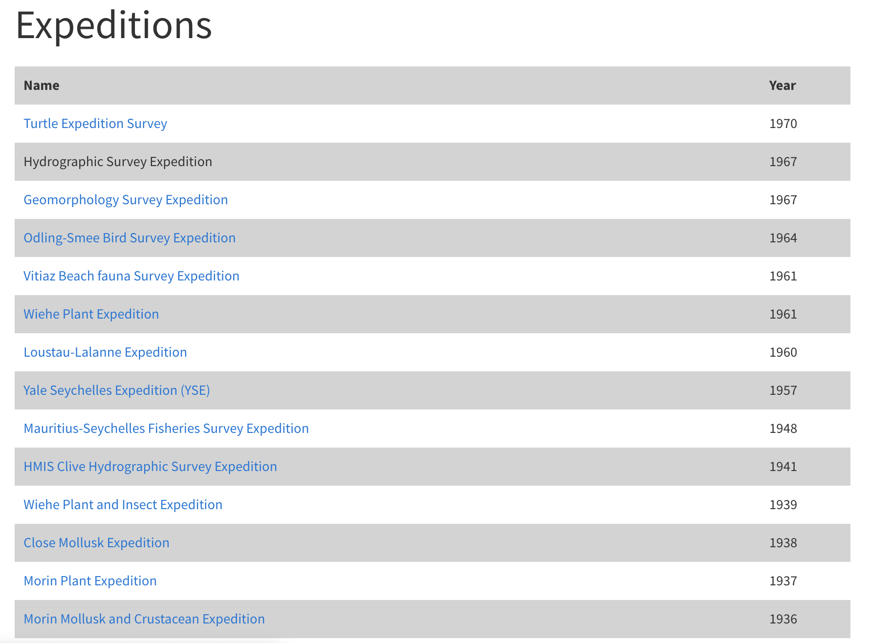
Before
The screenshots below show how the data had previously been represented on the Chagos Conservation Trust’s website.

The challenge
The start of the project involved creating a visual style and data visualisation treatment for a simple list of expeditions. The dataset contained a variety of long and short data fields such as expedition name, expedition description, organisation name and scientists on the expeditions. However there was an inconsistency across the dataset, and not every entry contained the same fields. We therefore decided that we should show the data on two levels. This involved hiding the more complex data on a second level which would be accessed by click. The first visual level of information would be ordered using data on the date of the expedition (we had this information for every data entry).
We used a grid system to show circles from the oldest to the newest on a snaking timeline. To access more information on each expedition, you could click into it to see information such as title, description, specific dates, and scientists involved.
The second challenge was to indicate another level of information about each expedition that could be easily understood and contained within a circle. When reading the long descriptions in the dataset, We found it interesting that scientists from a variety of scientific fields had visited the Chagos Islands. We wanted to communicate this, but we currently had no specific field to do so, so we created a categorisation field in order to communicate this. We then assigned a different icon and colour to each category. This then communicated the variety of expeditions both through colour and iconography in chronological order, creating a design that is accessible by using two types of visual indication (colour and iconography.)
Migration tracker
We also designed a user interface that would track the migration of tagged birds, while also adding a layer of information about them once selected. We added multiple levels of functionality and movement between tagged birds while integrating a clean, timeline interface across the bottom of the graphic.

